Last Updated on junio 17, 2024 by anytimedigital
As you navigate the digital landscape, you’re likely aware that a well-designed website is crucial for establishing trust and credibility with potential clients. However, what sets apart a great accounting firm website from a mediocre one? You might be wondering how to create a site that effectively communicates your expertise and services while providing a seamless user experience. Look no further. We’ve curated a list of the top 21 accounting firm website designs that showcase the perfect blend of style. In addition, functionality, and conversion-driven elements. Let’s dive in and explore the key takeaways to elevate your online presence.
Sleek & Modern Designs
While browsing through the top accounting firm websites, you’ll notice that many of them feature sleek and modern designs that exude professionalism and trustworthiness. These designs are just aesthetically pleasing. However, they also play a crucial role in building credibility with your potential clients.
Clean layouts and minimalism
For a modern accounting firm website, clean layouts and minimalism are vital. You want to make sure that your website is easy to navigate. Furthermore, that your visitors can quickly find the information they need. A cluttered website can be overwhelming and may drive potential clients away. By using a clean layout, you can guide your visitors’ attention to the most important elements of your website. For instance, your services, expertise, and call-to-actions. By embracing minimalism, you can create a sense of sophistication that will set your accounting firm apart from the competition. A simple and uncluttered design will also make it easier for you to highlight your unique value proposition and showcase your expertise.
Use of whitespace and simplicity
Some of the most effective modern accounting firm websites make liberal use of whitespace and simplicity. Whitespace, also known as negative space, refers to the empty space between and around elements on your website. By using whitespace effectively, you can create a sense of breathability and make your content more readable. By incorporating simplicity into your design, you can create a sense of clarity and focus. A simple design will help you to communicate your message more effectively. In addition, make it easier for your visitors to understand your services and expertise.
The use of whitespace and simplicity is particularly important for accounting firm websites. It can help to convey a sense of professionalism and trustworthiness. By creating a sense of calm and serenity, you can make your visitors feel more comfortable and build trust with them. This, in turn, can increase the chances of converting them into clients.
Professional & Trustworthy
As far as building trust with potential clients, your accounting firm’s website plays a crucial role. You want to convey a sense of professionalism and reliability. Therefore, making visitors feel confident in your services. A well-designed website can help you achieve this by incorporating certain key elements.
Established color schemes and branding
On the surface, a consistent color scheme and branding may seem like a minor detail. However, it can make a significant difference in how your firm is perceived. When you use a cohesive visual identity throughout your website, you’re telling visitors that you’re detail-oriented and care about the little things. This attention to detail can translate to your work as an accountant. Therefore, giving potential clients peace of mind. Moreover, a well-established brand helps to differentiate your firm from competitors. As a result, making you more memorable and increasing the chances of attracting new clients.
Prominent display of credentials
Displaying your credentials and certifications prominently on your website is vital for building trust with potential clients. You’ve worked hard to earn those credentials. Therefore, don’t be afraid to showcase them. This can include displaying certifications like CPA, CMA, or EA, as well as any industry-specific designations. By doing so, you’re providing visitors with tangible evidence of your expertise, making them more likely to trust your firm with their financial needs. Plus, when you prominently display your credentials, you’re also demonstrating transparency and accountability. This can go a long way in establishing a sense of trust with potential clients, who may be hesitant to work with an accounting firm that doesn’t provide clear evidence of their qualifications. By showcasing your credentials, you’re showing visitors that you’re proud of your accomplishments and willing to hold yourself to high standards.
User-Friendly Navigation
Even the most visually appealing website can fall short if it’s difficult for visitors to find what they’re looking for. A user-friendly navigation system is crucial to ensure that your accounting firm’s website is easy to navigate. As a result, allowing visitors to quickly access the information they need.
Intuitive Menu Systems and Search
Any accounting firm website worth its salt should have an intuitive menu system that makes it easy for visitors to find what they’re looking for. This means organizing your menu items in a logical and consistent manner, using clear and concise labels, and minimizing clutter. A well-designed menu system should also be responsive. Therefore, adapting seamlessly to different devices and screen sizes. Additionally, a robust search function can help visitors quickly find specific information. For instance, services, resources, or team members. By incorporating an intuitive menu system and search function, you can reduce bounce rates, increase engagement, and improve the overall user experience. This, in turn, can lead to increased trust and credibility, as visitors are more likely to perceive your firm as organized, efficient, and customer-centric.
Clear Calls-to-Action and CTAs
Little things can make a big difference when it comes to converting visitors into leads. Clear calls-to-action (CTAs) and prominent CTAs can guide visitors through your website, encouraging them to take specific actions, such as scheduling a consultation, downloading a resource, or contacting your firm. By using action-oriented language, contrasting colors, and strategically placing CTAs throughout your website, you can create a sense of urgency and encourage visitors to take action.
Menu items, such as “Contact Us” or “Get Started,” should be prominently displayed and easily accessible, making it simple for visitors to initiate contact or take the next step. By incorporating clear CTAs and menu items, you can create a seamless user experience, increase conversions, and ultimately drive business growth.
Financial Industry Experts
After reviewing numerous accounting firm websites, it’s clear that showcasing expertise in specific financial industries is crucial for building trust and credibility with potential clients.
Showcase of Specialized Services
To differentiate themselves from competitors, many top accounting firms highlight their specialized services for specific industries. For example, healthcare, non-profit, or real estate. By doing so, they demonstrate a deep understanding of the unique challenges and regulations faced by businesses in these industries. This targeted approach helps establish the firm as a trusted advisor and expert in their field. For instance, an accounting firm that specializes in serving healthcare clients may feature a section on their website dedicated to explaining the nuances of medical billing and coding, or the implications of the Affordable Care Act on healthcare providers. This level of expertise and knowledge showcases the firm’s ability to provide tailored solutions that meet the specific needs of healthcare clients.
Highlighting Industry Expertise
Services tailored to specific industries are a key differentiator for accounting firms. By highlighting their industry expertise, firms can attract clients who are seeking specialized knowledge and guidance. This expertise can be showcased through various means, such as blog posts, whitepapers, webinars, or even video testimonials from satisfied clients. Firms can also highlight their industry expertise by featuring case studies or success stories that demonstrate their ability to solve complex financial problems for clients in specific industries. This helps potential clients understand the firm’s capabilities and see the tangible results of their expertise.
Showcasing The 21 Best Accounting Firm Website Designs
Let’s dive into the world of accounting firm websites. But not just any run-of-the-mill sites! We’re talking about the crème de la crème. These are the 21 best accounting firm website designs that make you want to immediately entrust your financial matters to their capable hands, even if your books are already perfectly balanced.
Deloitte
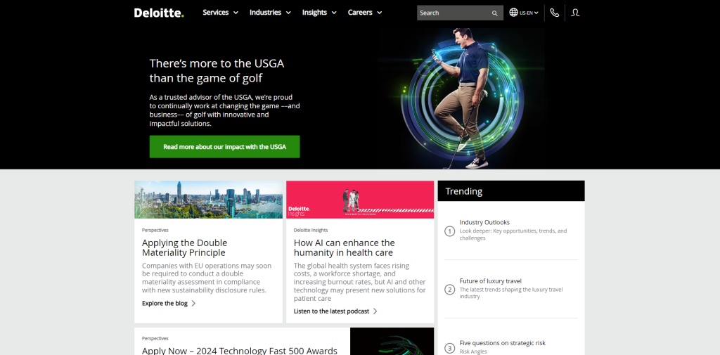
Deloitte, a titan in the accounting world, hardly needs an introduction. Their website design is a masterclass in both functionality and visual appeal. Therefore, setting a high bar for others to aspire to. Imagine your own accounting firm’s website: a clean, crisp, and inviting digital space. Picture a homepage layout that exudes the clarity and organization of a well-structured news site. In addition, complemented by intuitive drop-down navigation that makes exploring your services a breeze. This approach goes beyond mere simplicity; it’s about crafting an online experience that communicates your expertise and approachability in equal measure.
Wipfli
Wipfli LLP’s website is a shining example of what an accounting firm’s online presence should aspire to be. With its concise yet captivating homepage, the site draws you in and encourages you to explore further. The thoughtful layout and user-friendly design make navigating the site a pleasure. Therefore, ensuring that visitors can easily find the information they seek. What sets Wipfli LLP apart is their innovative dual navigation system. One menu keeps you up-to-date with the latest happenings and industry insights, while the other showcases the firm’s impressive range of services and the diverse sectors they serve.
Verdant
Verdant’s accounting website is a masterclass in storytelling through simplicity. From the moment you land on their site, you’re immersed in their brand’s narrative thanks to a captivating full-screen video that seamlessly guides you through their journey. The site goes beyond merely listing services; it highlights Verdant’s strengths with impactful callouts that grab your attention. Moreover, Verdant provides a concise yet thorough company overview. Therefore, allowing visitors to quickly understand their values and expertise.
Regal Group CPA
Regal Group CPA’s website is a prime example of how a well-designed site can effectively showcase an accounting firm’s services and expertise. The San Diego-based firm offers a comprehensive range of services, including tax preparation and planning, accounting, payroll, and consulting. What sets their website apart is its clear and intuitive navigation system, which allows visitors to easily find the information they need. The bold fonts used throughout the site not only enhance readability but also add a touch of professionalism and authority.
Baker Tilly
Baker Tilly’s website is a shining example of how an accounting firm can create a visually stunning online presence without sacrificing performance. The site’s graphics-intensive layout is a feast for the eyes, yet it manages to maintain a swift and smooth user experience across both mobile and desktop platforms. This is a testament to the power of well-executed design in today’s mobile-first digital landscape. The strategic use of color on Baker Tilly’s site is particularly noteworthy. By employing neon green accents sparingly, the design not only enhances the overall aesthetic but also cleverly guides users’ attention to key areas of interest.
Moss Adams
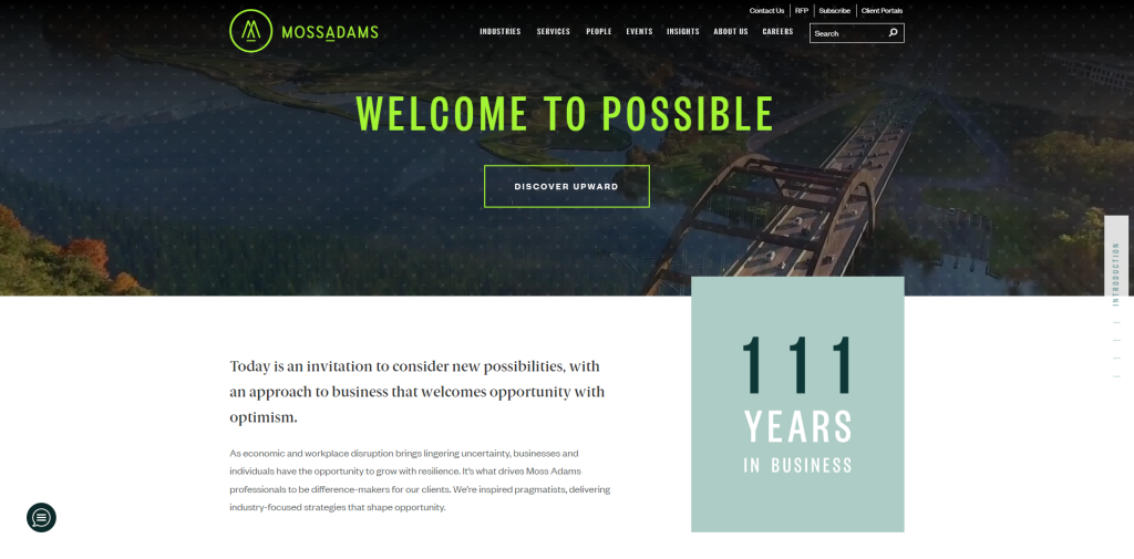
The Moss Adams website is a stunning example of a modern and futuristic accounting firm website. With its innovative use of parallax scrolling and captivating hover effects, the site offers a truly immersive and engaging user experience. What sets this website apart is its unique approach to the hero section. Instead of dedicating a large portion of the page to a single image or message, Moss Adams prioritizes content, ensuring that visitors can quickly access the information they need.
Mewco
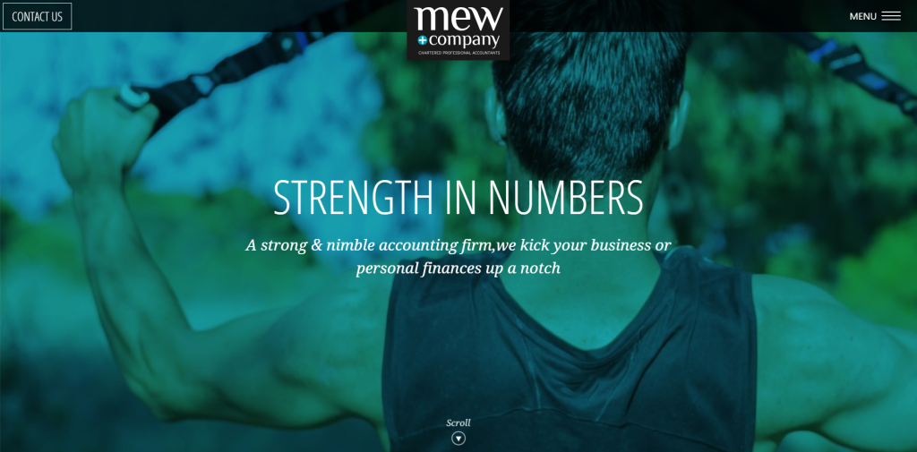
Mew’s accounting website is a masterclass in design, seamlessly blending visual appeal with brand identity. From the moment you land on their site, you’re greeted by a harmonious integration of the company’s signature blue hue, which elegantly flows through overlays, calls-to-action, and headlines. This cohesive color scheme not only creates a memorable visual experience but also reinforces Mew’s unique brand presence. Navigation is a breeze, thanks to the site’s simple and intuitive layout.
Dugan Lopatka
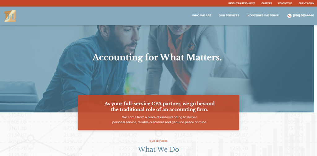
Dugan Lopatka, an accounting firm with a remarkable 50-year history serving the Chicago region, has crafted a website that perfectly reflects their expertise and commitment to their clients. The site’s clean layout and soothing color palette create a welcoming and professional atmosphere, making it easy for visitors to explore the firm’s comprehensive range of services. With its user-friendly navigation and thoughtful design, Dugan Lopatka’s website sets a high standard for accounting firms looking to establish a strong online presence while prioritizing their clients’ experience.
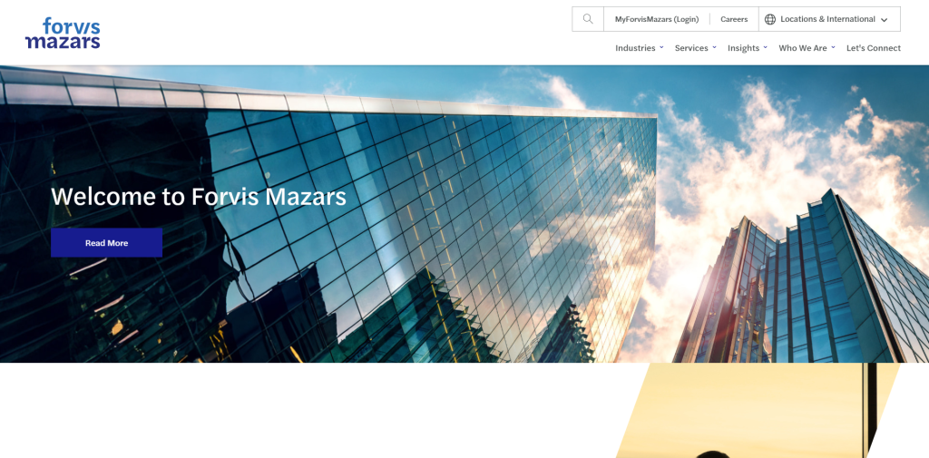
Forvis Mazars
Wasserman cpa
Marc Wasserman’s accounting website is a prime example of how a personal brand can be effectively showcased online. Furthermore, the website’s visual appeal extends beyond its personal branding elements. Small animations, such as section descriptions that transition from grey to blue, add a dynamic and engaging touch. The services and testimonials sections feature subtle fade-ins, drawing the visitor’s attention and making the content more attractive. These design choices demonstrate a keen understanding of user experience and the importance of creating a visually captivating website.
Jack Levine
Jack Levine CPA’s website is a shining example of how a boutique accounting firm can establish a strong online presence that exudes professionalism and expertise. The site’s corporate blue color scheme, combined with clear, easy-to-read fonts, creates a sense of trust and reliability from the moment visitors land on the page. The navigation is intuitive and straightforward, allowing potential clients to quickly find the information they need about the firm’s specializations in corporate tax and accounting services for businesses, individuals, estates, and trusts.
Pinnacle Tax Services
Pinnacle’s website is a masterclass in accounting website design, setting a new standard for user experience and visual appeal. From the moment you land on their site, you’re greeted with a clean, intuitive interface that makes navigation a breeze. The grid format organizes information in a logical, easy-to-digest manner, while the strategic use of icons brings complex accounting concepts to life, making them accessible to all visitors. Through these elements, Pinnacle’s website goes beyond mere information sharing. It captivates visitors, highlighting the firm’s expertise in crafting an online space that seamlessly blends form and function.
Robert Hall & Associates
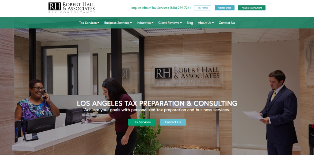
Robert Hall’s website stands out from the crowd by avoiding the common pitfall of relying on generic stock photos. Instead, the firm has made a conscious effort to showcase images of their own team and staff throughout the site. This authentic approach helps foster a genuine connection with potential clients, allowing them to put faces to the names and build trust in the company’s expertise. By showcasing real photos of their team, Robert Hall demonstrates transparency and a commitment to building relationships with their clients. This personal touch sets the firm apart from competitors who opt for impersonal, stock imagery.
Solomon Hardwick
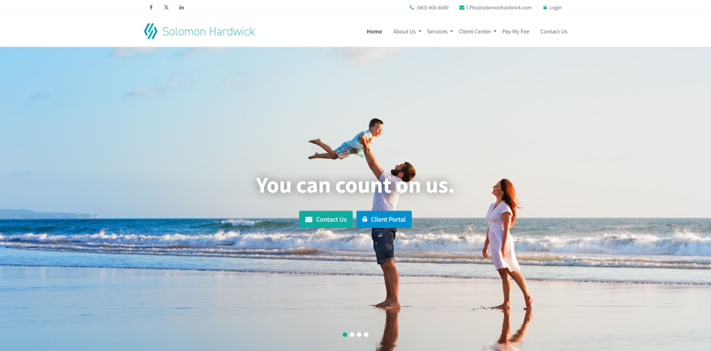
Solomon Hardwick’s website showcases their expertise in providing tax services to both businesses and individuals. The landing page employs several engaging tactics to capture visitors’ attention and encourage them to explore further. The responsive animations that come to life when hovering over various elements add a dynamic and interactive feel to the site, making it more enjoyable to navigate. The website’s call-to-action elements are strategically placed, with contact details easily accessible in the navigation bar and a prominent button in the header section. This makes it simple for visitors to reach out to the firm and initiate a conversation.
Mowery & Schoenfeld
Mowery & Schoenfeld, a leading accounting firm in Illinois, has crafted a website that perfectly reflects their commitment to providing reliable and forward-thinking partnerships to businesses. The site’s clean layout, characterized by ample white space and clear, easy-to-read fonts, ensures a seamless user experience. The professional corporate blue color scheme, accented with subtle touches of gold, instills a sense of trust and credibility, reinforcing the firm’s position as a top 10 player in the state. One of the standout features of Mowery & Schoenfeld’s website is the wealth of resources and blog articles available to visitors. This valuable content demonstrates the firm’s expertise and thought leadership.
The Wow Company
The Wow Company’s accounting website is a breath of fresh air in the often monotonous world of financial services. This isn’t just another ordinary CPA firm website; it’s a captivating journey into a humanistic approach, introducing you to the faces behind the numbers. As you navigate through the site, you’ll find yourself connecting with smiling teams of accounting professionals, establishing a personal bond with the very people entrusted with your finances. The Wow Company understands that it’s not just about showcasing expertise; it’s about introducing the individuals who make up the team, complete with employee photos that bring the firm to life.
Heyer Accounting
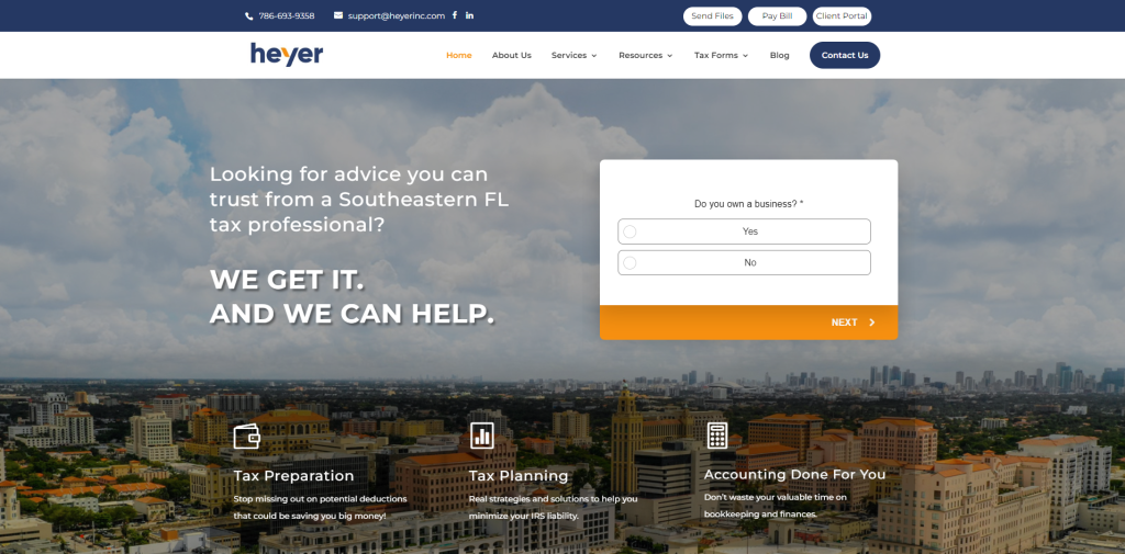
The Heyer Accounting website is a shining example of how simplicity and functionality can come together to create a truly remarkable user experience. The header of the site is particularly impressive, with a clean and uncluttered presentation that immediately draws the eye. The call-to-action (CTA) button stands out beautifully, ensuring that visitors can easily take the next step in engaging with the firm. The overall layout of the website is a testament to the power of minimalism, with a streamlined design that is both easy to navigate and visually appealing.
Seattle CPA Professionals
Doeren Mayhew
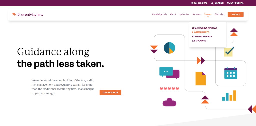
Doeren Mayhew’s website is a testament to the firm’s well-established reputation, serious approach to business, and unwavering confidence in their capabilities. The design alone exudes an air of professionalism and expertise, assuring visitors that they are in the hands of a trusted and experienced accounting firm. What sets Doeren Mayhew apart is their deep understanding of the intricacies involved in tax, audit, risk management, and regulatory landscapes. This knowledge goes far beyond what traditional accounting firms offer, providing clients with a distinct advantage.
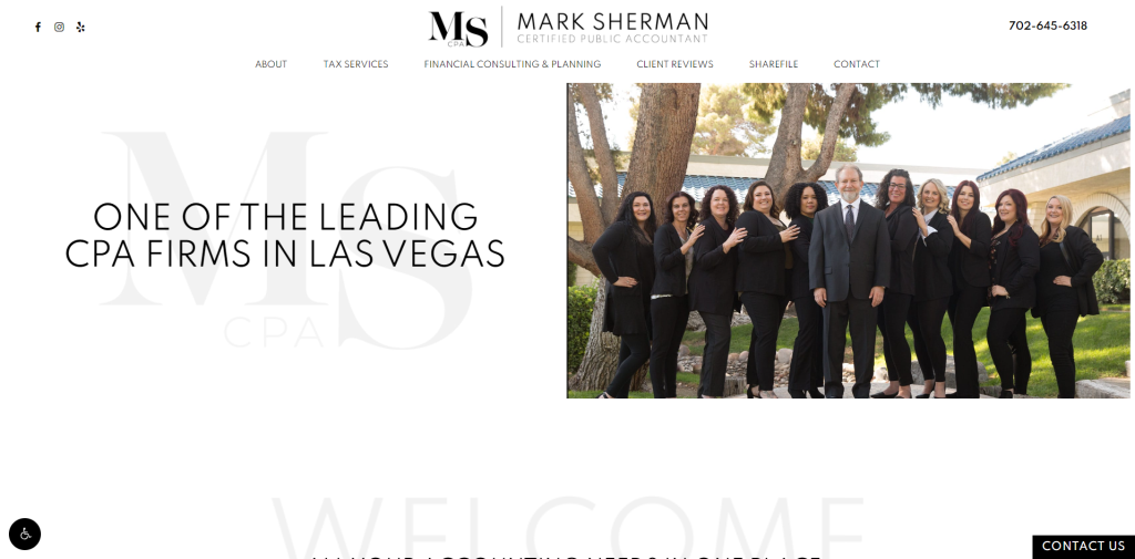
Mark Sherman CPA
Webster Rogers
Webster Rogers website showcases the firm’s position as a leading South Carolina-based accounting and consulting firm, with a design that effectively balances creativity and professionalism. The standout feature of the homepage is the engaging video, which adds a personal touch while simultaneously addressing the needs of large-scale enterprises. This innovative approach demonstrates Webster Rogers LLP’s ability to connect with clients on a human level while delivering the expertise and resources required by complex businesses.
Creating Your Accounting Firm Website
In today’s digital age, having a professional and informative website is essential for accounting firms. Building a website is no longer a daunting task, and with the right tools and guidance, you can have your accounting firm’s online presence up and running in no time. Let’s break down the simple steps to create your accounting firm’s website quickly and efficiently.
CHOOSE THE RIGHT PLATFORM
Selecting the appropriate platform for your accounting firm’s website is crucial. If you’re looking for a user-friendly option that allows for quick setup, consider platforms like Wix or Squarespace. These platforms are ideal for those who want to focus on providing excellent accounting services rather than spending time coding websites. However, if you require more functionality and want a website that is optimized for search engines, WordPress is the recommended choice.
SELECT YOUR DOMAIN NAME
Choosing the perfect domain name for your accounting firm’s website is an important decision. Your domain name should be memorable, relevant, and easily associated with your business. Here are some tips to keep in mind:
Keep it professional: Include words related to accounting, such as ‘CPA’, ‘accounting’, or ‘tax’. This helps visitors immediately identify the nature of your business.
Brevity is best: Opt for a short and concise domain name. Long domains are harder to remember and more prone to typos.
Stick with .com: While there are various domain extensions available (.net, .info, .biz), .com remains the most widely recognized and easiest for clients to remember. Tools like NameCheap’s Beast Mode can help you search for multiple keyword combinations efficiently.
REGISTER YOUR DOMAIN NAME
Once you’ve found the perfect domain name for your accounting firm, it’s time to make it official.
Follow these steps to register your domain:
- Visit a reputable domain registrar website, such as GoDaddy or NameCheap.
- Enter your chosen domain name into the search box and press enter.
- If your desired domain is available, add it to your cart and proceed with the checkout process.
UTILIZE TEMPLATES FOR EFFICIENT DESIGN
Templates are a game-changer when it comes to designing your accounting firm’s website. They offer pre-designed layouts and elements tailored specifically for businesses like yours. By using templates, you can save time and effort while still creating a professional and visually appealing website. Customize the templates by selecting colors that align with your brand identity and adding unique elements to make the site your own. Most platforms offer a wide range of template options, ensuring that you can find the perfect fit for your accounting firm.
POST-LAUNCH MARKETING STRATEGIES FOR YOUR ACCOUNTING FIRM
Congratulations on launching your accounting firm’s website! However, the work doesn’t stop there. To attract clients and establish your online presence, consider implementing the following accounting firm digital marketing strategies:
Pay-Per-Click (PPC) Advertising: Consider running targeted PPC campaigns on search engines like Google Ads or Bing Ads. PPC allows you to display ads to users searching for accounting services in your area. Carefully select relevant keywords and create compelling ad copy to drive qualified traffic to your website.
Redes Social: Establish a strong presence on professional social media platforms like LinkedIn. Share informative content about accounting, tax tips, and industry updates. Engage with your audience, respond to comments and messages promptly, and consider running targeted social media advertising campaigns.
Conclusión
On the whole, you’ve now gained a complete understanding of the significance of a well-designed accounting firm website in building trust and credibility with your clients. A well-thought-out design is crucial in establishing your firm’s online presence, and you’ve learned the key elements that your website should possess. For example, including a clear navigation, prominent call-to-actions, and a seamless user experience. By incorporating these vital features, you’ll be able to create a website that effectively communicates your services.


