Last Updated on octubre 14, 2024 by anytimedigital
Over the years, a well-crafted website has become an integral part of any assisted living facility’s marketing strategy. As families search for care options, your website serves as their first impression, conveying trust and comfort. In this article, we present the 25 best assisted living website designs that excel in appearance, user experience, and design quality. By exploring these exemplary websites, you can gain valuable insights to enhance your own online presence and effectively serve your audience’s needs.
Criteria for Evaluation
Appearance
Experiencia de usuario
Design Quality
The Top Assisted Living Website Designs
Atria Senior Living
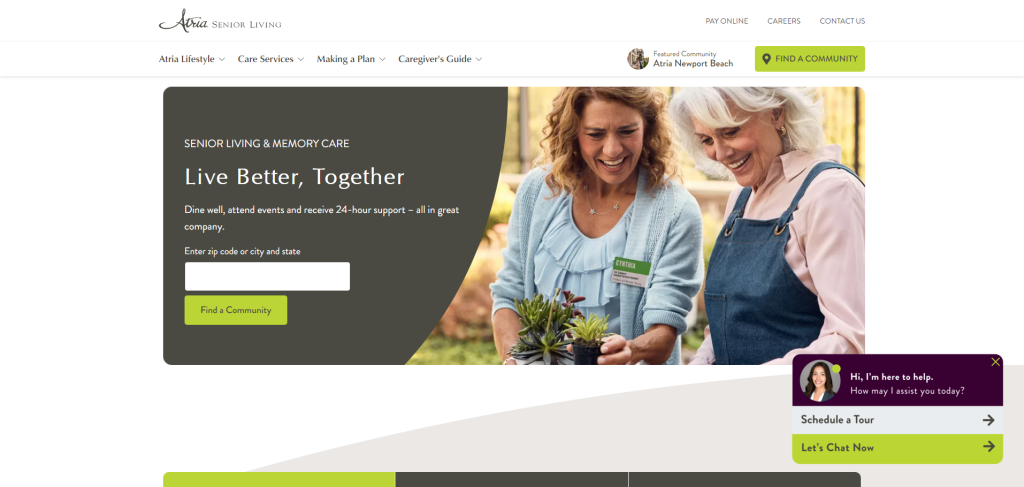
Atria’s website has a clean, welcoming design with soothing colors. Navigation is easy, with clear options for learning about locations, services, and amenities. The site effectively balances visuals and text, using large images of seniors enjoying life, which adds to the emotional appeal. Lastly, the call-to-action buttons are visible and lead users toward scheduling tours or requesting information.
Brookdale Senior Living
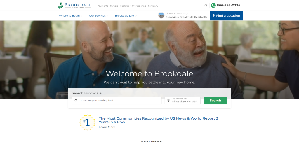
Brookdale’s site is very professional with a focus on accessibility and clean navigation. The design is minimalist with plenty of white space. Therefore, making it easy to find essential information. It emphasizes services and locations and features a helpful search tool. The homepage highlights their wide range of services, and the blog and resources section adds value.
Sunrise Senior Living
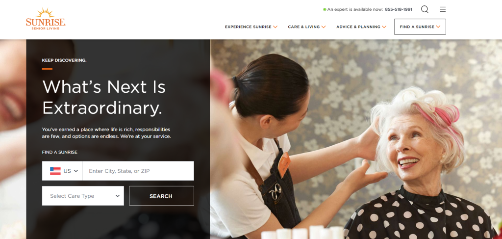
Sunrise’s website is visually appealing, with soft, comforting colors and large, inviting imagery. The user experience is smooth, with a search function for nearby locations and simple drop-down menus. The focus is on storytelling, which helps convey the sense of community. Overall, the design is warm, reflecting their care-focused approach.
Five Star Senior Living
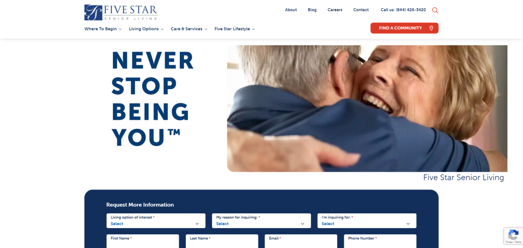
Five Star Senior Living has a modern website with a friendly design. The homepage features large banners with rotating images of residents and staff, which brings a personal touch. Their layout is intuitive. Therefore, making it easy for users to find care options and explore locations. The color scheme and visuals are calming, creating a sense of professionalism and care.
Senior Lifestyle
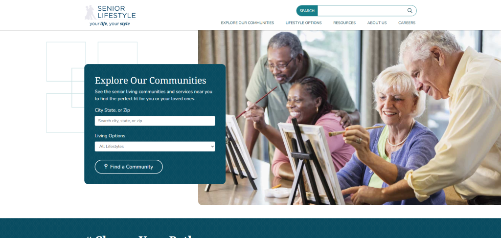
This site uses bright colors and uplifting imagery of seniors and staff, creating a positive vibe. The design is functional with plenty of information on the homepage. However, it manages to avoid feeling cluttered. The navigation is clear, and users can easily explore care options and locations. The website balances modern design with user-friendliness.
Holiday Senior Living
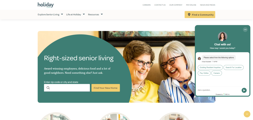
Holiday’s website has a fresh, airy design that feels inviting. The homepage features large images of seniors and nature, which helps create a serene atmosphere. The layout is simple and the navigation easy, with clear categories for different living options. The color palette is calm, and the website’s overall user experience is excellent.
LCS Senior Living
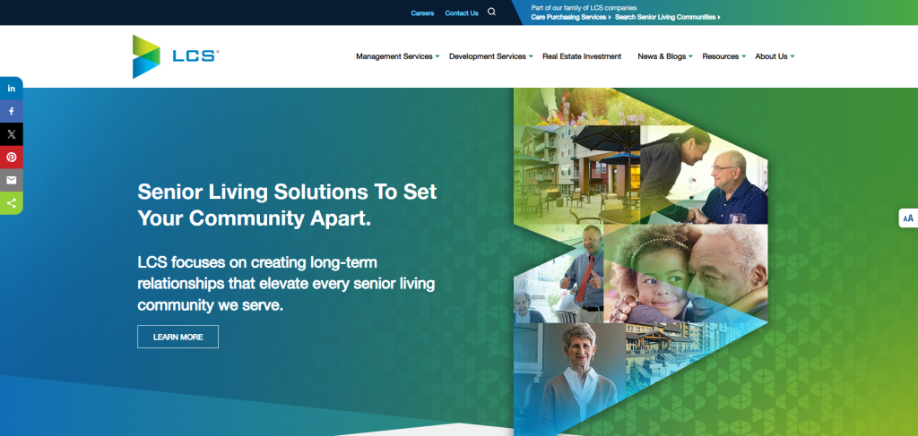
LCS Senior Living’s website has a modern, professional look with clear calls to action. It’s visually sleek, with a simple, organized structure. The navigation bar is intuitive, leading users to services, locations, and resources. The large images and sharp typography make the website feel high-end, but the user experience remains accessible.
american House
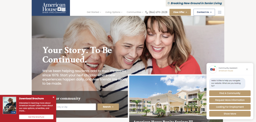
American House’s website is designed with bold colors and clear messaging. It has a professional look, with large call-to-action buttons and easy navigation to different locations and care options. The overall layout is clean and user-friendly, with a focus on resident stories and amenities.
Watermark Retirement Communities
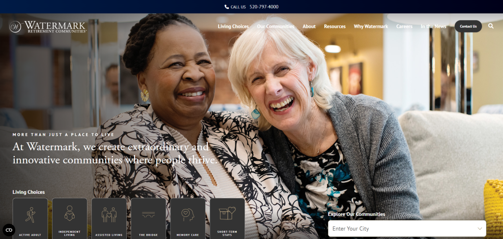
Watermark’s website features beautiful visuals and a refined, minimalist design. The color palette is soft, using warm tones that create a welcoming and peaceful atmosphere. The homepage is visually clean, with large images of community life that give visitors an immediate sense of the environment. Navigation is straightforward, with clear sections that guide users through the different care options, locations, and lifestyle amenities. The site emphasizes luxury and high-quality care without being overwhelming, striking a good balance between aesthetics and usability.
Acts Retirement Life Communities
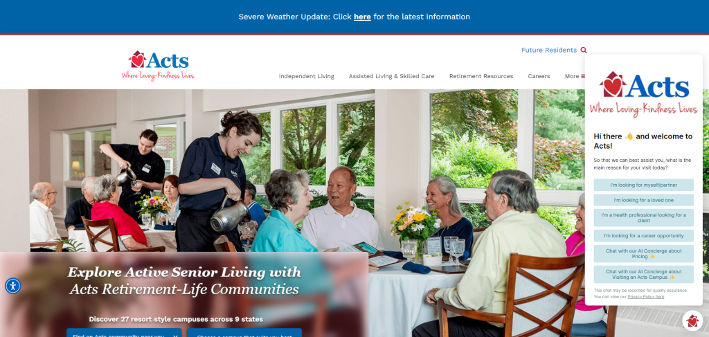
Acts Retirement has a clean, professional website that focuses on ease of navigation. Large, rotating banners showcase different community settings and activities, giving users a welcoming feel. The menu is straightforward, with helpful sections on locations, services, and resources. The color palette is calming, and the use of images helps humanize the content.
Erickson Living
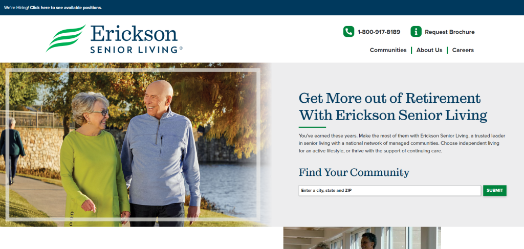
Erickson Senior Living’s website combines beautiful, full-width images with a clean, minimalist design. The homepage is simple, featuring links to explore various communities and services. It’s easy to navigate, with clear CTAs that direct users to find a location or request more information. The professional tone of the website enhances its credibility and trustworthiness.
Covenant Living Communities
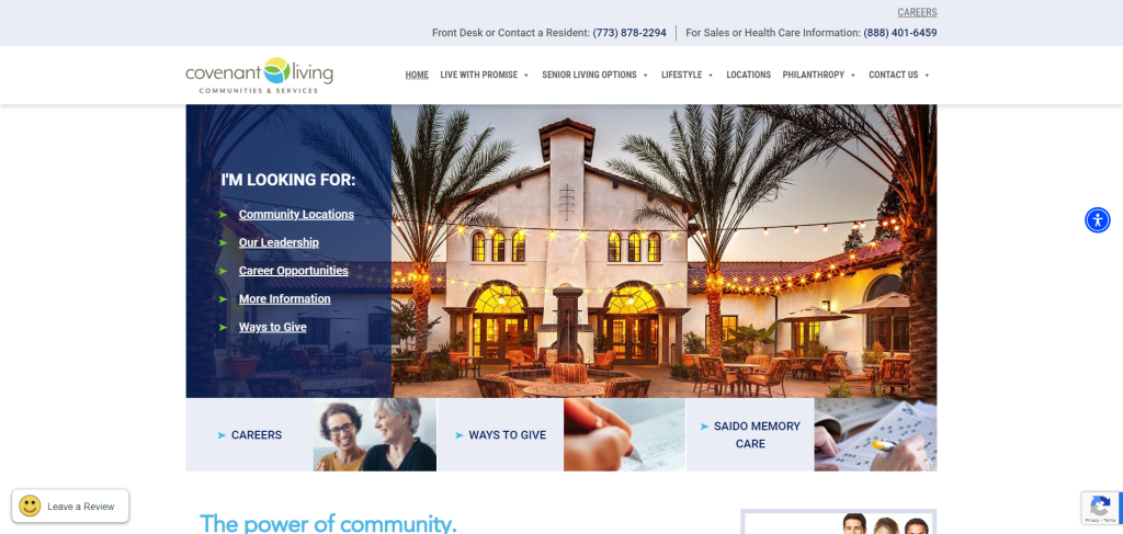
Covenant Living’s site is well-organized, with an inviting color scheme and professional layout. The homepage is packed with essential information but is structured in a way that feels approachable. The navigation menu allows users to quickly find what they need, and the overall design is user-friendly and focused on helping prospective residents feel informed.
the Arbor Company
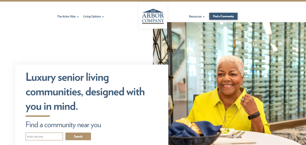
The Arbor Company’s website is bright and engaging, with large, uplifting images of residents enjoying life. The design is modern and minimalistic, with a strong focus on helping users find the information they need quickly. Navigation is smooth, and the overall user experience is welcoming and positive. The site is focused on highlighting community life and personal care options.
Benchmark Senior Living
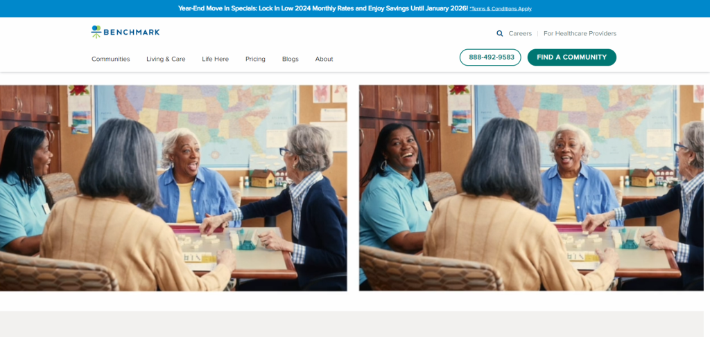
Benchmark Senior Living’s site has a polished, high-end feel with elegant imagery and calming colors. The layout is well thought out. Therefore, making it easy for users to explore care options, browse locations, and learn about the company’s mission. The website’s design is focused on creating an emotional connection through testimonials and personal stories.
Discovery Senior Living
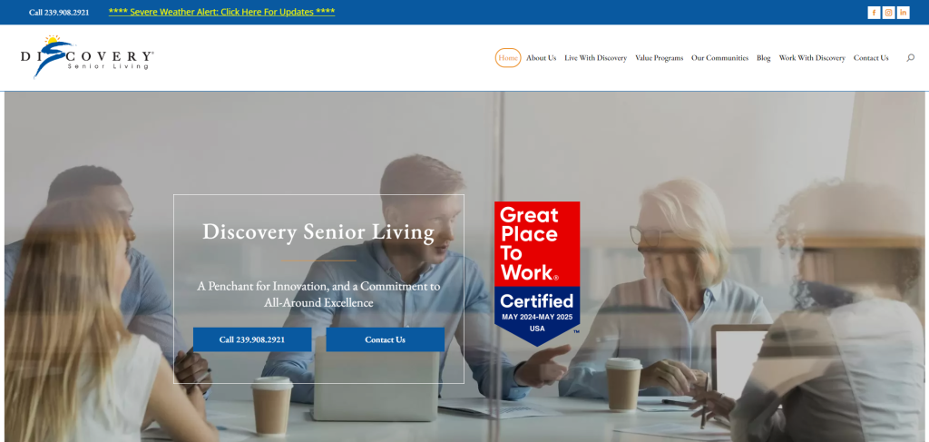
Discovery Senior Living’s site is user-friendly, with a clean and modern design that emphasizes visuals of beautiful communities. The site is easy to navigate, and the location finder tool is especially convenient. The site balances aesthetics with practical functionality, making it easy to explore care options and amenities.
Brightview Senior Living
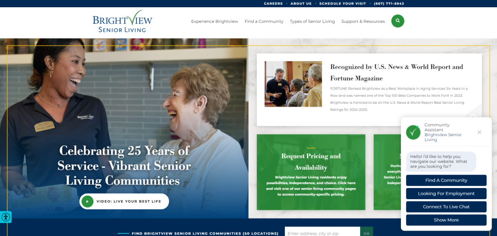
Brightview’s website stands out for its bright, colorful design and positive imagery. The homepage highlights the community’s activities and lifestyle options, while the navigation is simple and intuitive. Users can easily browse care options and locations. The site’s design is warm and friendly, which matches the brand’s focus on active, engaging lifestyles for seniors.
Bridge Senior Living
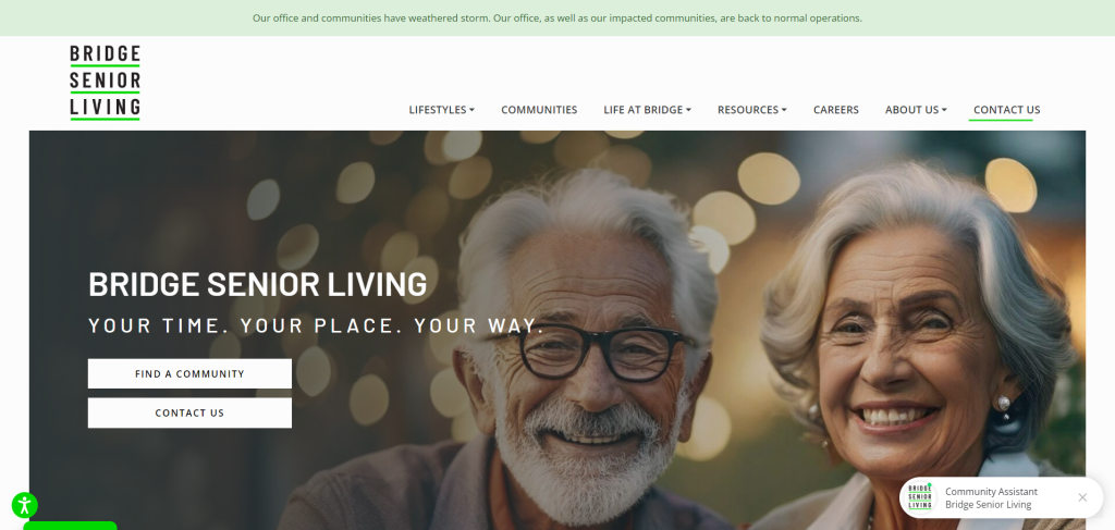
The Bridge Senior Living website is modern and visually appealing, with a fresh color scheme and plenty of images showcasing its communities. The homepage is well-organized and user-friendly, with clear categories for different care options. The design is sophisticated but approachable, making it easy for users to feel at ease while browsing the site.
The Springs Living
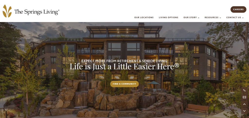
The Springs Living offers a warm and inviting website with a modern design. The homepage features large, vibrant images and testimonials that focus on community life. The navigation is clear, and users can easily explore different living options and services. The website’s design is professional and approachable, emphasizing a personalized experience for residents.
Belmont Village
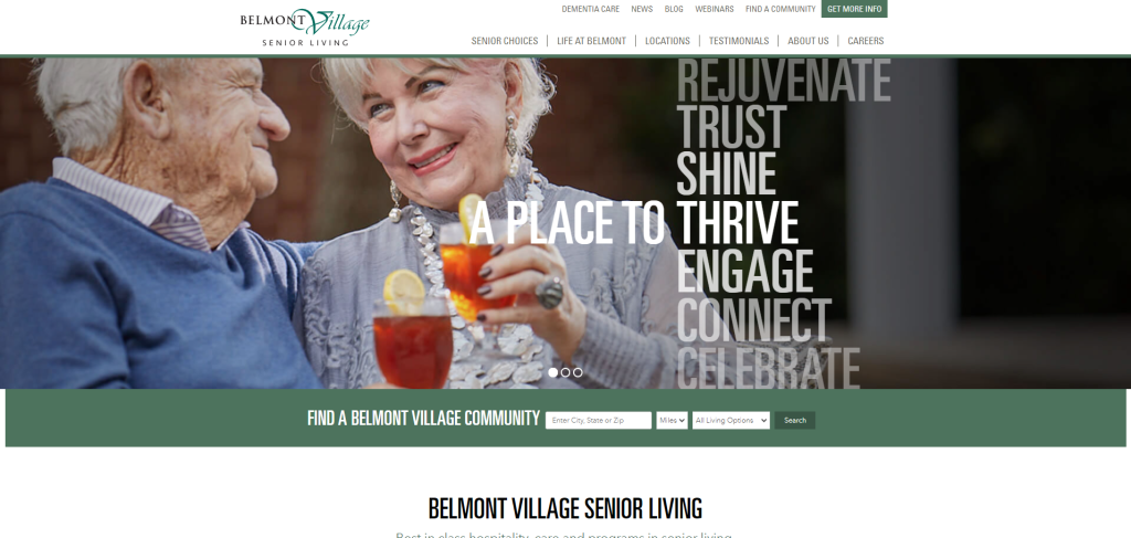
Belmont Village’s website offers a well-organized design that emphasizes large, professional images of community activities. The color scheme is soft, giving the site a serene feel. The navigation is clear, with easy access to care services, locations, and resident testimonials. The website’s design promotes trust, focusing on the quality of care and community life.
Morningstar Senior Living
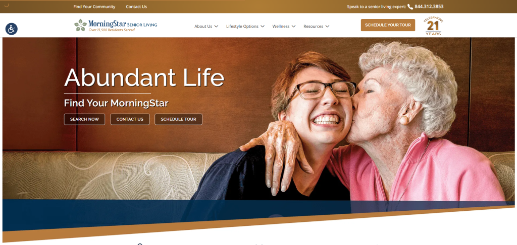
Morning Star Senior Living’s website features a beautiful, modern design with uplifting imagery and calming colors. The navigation is simple, with a focus on helping users explore locations and care services quickly. The site emphasizes community life, with testimonials and visuals that create a warm and welcoming experience.
Aegis Living
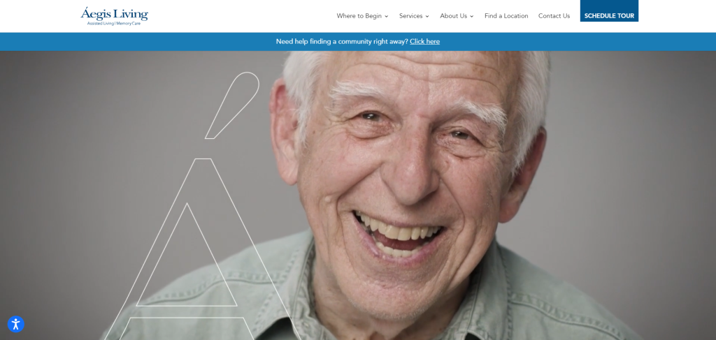
Aegis Living has a luxurious website design that feels premium and professional. Large, high-quality images dominate the homepage, giving visitors a clear sense of what community life is like. The site is easy to navigate, with clear sections for care options and services. The design quality is excellent, focusing on a high-end experience that reflects the brand’s reputation.
VI Living
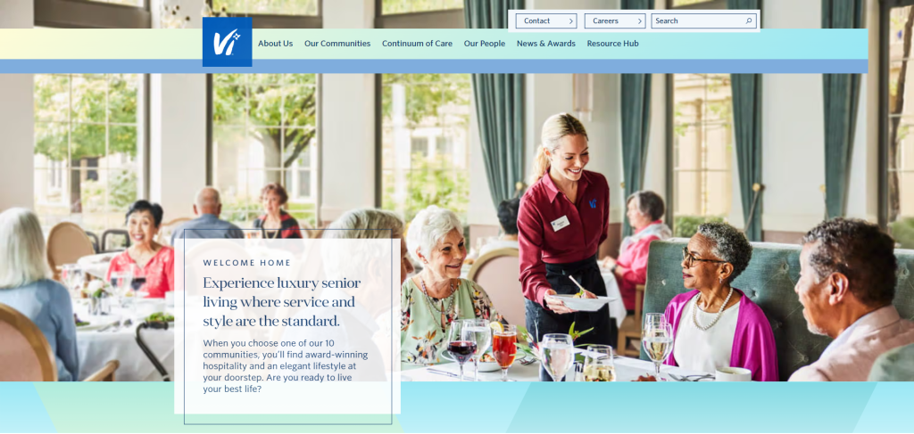
Vi Living’s website has a sleek and elegant design that mirrors the luxury lifestyle they offer. The use of rich colors and sophisticated fonts gives it a high-end feel, while large images of the communities and residents provide a welcoming atmosphere. The navigation is intuitive, with clearly defined sections for services, amenities, and locations. The site also includes engaging video content that enhances the user experience and helps prospective residents visualize life at a Vi community.
Maplewood Senior Living
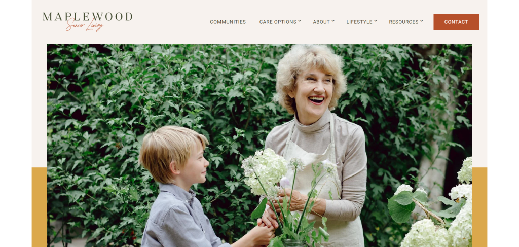
Maplewood Senior Living’s website is visually appealing and easy to navigate, with a clean layout and calming color palette. The homepage prominently displays images of its beautiful facilities and offers a quick menu for finding services, locations, and care types. The site has an elegant and friendly tone, making it easy for users to explore living options without feeling overwhelmed. A well-organized “Virtual Tour” option also provides a great digital experience for potential residents or families exploring options remotely.
Anthology Senior Living
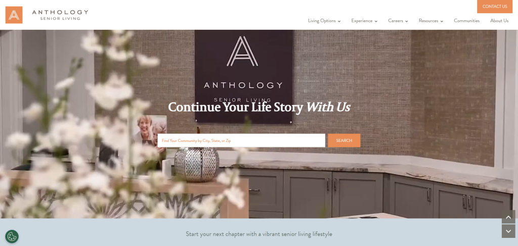
Anthology Senior Living’s website features a modern and visually appealing design, with a strong focus on storytelling through large, vibrant images, videos and testimonials from residents. The homepage is user-friendly, highlighting key services like memory care and assisted living while offering easy navigation to explore communities. The site’s color scheme and typography give it a contemporary feel, and the overall design is polished yet welcoming. The “Explore Our Communities” feature provides an excellent user experience, allowing visitors to quickly find local options.
Pegasus Senior Living
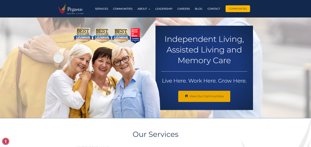
Pegasus Senior Living’s website offers a clean, intuitive design that makes it easy for users to find information on services, communities, and care levels. The homepage uses warm, inviting colors and large images of happy residents and staff, which helps create a welcoming environment. The navigation is straightforward, and users can quickly access resources like pricing, care options, and virtual tours. Overall, the design is simple yet professional, with a focus on providing clear and accessible information for prospective residents and their families.
Key Features to Include in Your Assisted Living Website
- Clear, accessible information about services offered
- High-quality images showcasing residents and staff
- Responsive design optimized for mobile and desktop users
- Virtual tours that enhance user experience
- Easy-to-find contact information and scheduling capabilities
- Location finder for multiple facilities
- Blog or resource section for helpful articles and guides
- Testimonials and case studies from families and residents
- Social media integration for community engagement
Any website that effectively utilizes these features will not only stand out aesthetically but will also facilitate informed decision-making for families in need of assisted living services.
Essential Navigation Elements
Beside appearance and design quality, your website must also prioritize intuitive navigation that allows users to easily find the information they seek. Clear menus and well-organized categories will guide potential residents and their families to service descriptions, staff bios, and community features without frustration. Consider implementing a search function, as it can significantly enhance user accessibility, allowing for quick retrieval of important information.
Furthermore, employing concise bullet points and dropdown menus can help in presenting crucial details in an organized and digestible manner. Be mindful of, your visitors may be under stress when searching for assisted living options; thus, creating a smooth navigation experience can prove invaluable in earning their trust and guiding them through the decision-making process.
Engaging Content and Visuals
Below the technical features and navigation, having engaging content and visuals on your website plays a vital role in making a lasting impression. Quality imagery not only showcases your facility but also creates an emotional connection, reflecting the warm and inviting atmosphere that you provide for residents. Thoughtfully crafted content, including informative articles and personal stories, adds depth to your site while helping to establish your brand’s authority in the assisted living community.
Living in an age where visuals dominate online interactions, leveraging high-quality photos and videos is crucial for capturing attention. Pair these images with well-written descriptions that highlight your facility’s unique aspects, such as community events and resident activities. When users feel an emotional connection through engaging content and relatable visuals, they are more likely to trust your facility and consider it as a viable option for their loved ones.
Steps to Create an Effective Assisted Living Website
Despite the increasing number of online resources available for families seeking assisted living options, having a standout website remains important for your facility. A well-structured site not only conveys trust and professionalism but also becomes an invaluable tool for guiding potential clients through the decision-making process. To achieve this, you need to implement various strategic steps that go beyond just aesthetics and functionality.
Defining Your Brand
Around the foundation of your website lies your brand identity, which sets the tone for how potential residents and their families perceive your facility. You should start by clearly defining your core values, mission, and unique selling propositions. This identity will guide the visual elements of your website, from color schemes and typography to the imagery used, ensuring that they resonate with your target audience. Emphasizing warmth and care through your website’s design can create an inviting atmosphere for families when exploring their options.
Choosing the Right Platform
To establish a strong online presence, selecting the right website platform is crucial, as it can significantly impact your site’s performance, user experience, and ease of management. You should consider whether you want a simple content management system that requires minimal technical expertise or a more advanced platform with comprehensive features that may demand additional learning. Evaluating options like WordPress, Squarespace, or Wix can help you find a solution that aligns with your goals and capabilities.
Hence, after weighing your options, you must make a choice that not only enables you to create a visually appealing website but also supports important functionalities such as SEO optimization and responsive design. The right platform will serve as the backbone of your online presence, allowing you to easily update information, post engaging content, and provide resources for families in need of assisted living services.
Importance of SEO and Online Presence
To remain competitive in the assisted living industry, establishing a robust online presence and optimizing your website for search engines is imperative. Families often turn to the internet to research care options for their loved ones, making it imperative for your facility to appear prominently in search engine results. A well-optimized website not only enhances visibility but also builds trust with potential clients by positioning your facility as a credible and informative resource. This approach can drive more visitors to your site, ultimately leading to increased inquiries and tours.
Optimizing for Search Engines
Below are several key strategies you can implement to enhance your website’s search engine optimization (SEO). Start by conducting keyword research to identify terms your target audience is using to search for assisted living options. Incorporate these keywords naturally throughout your site, including in headings, meta descriptions, and alt text for images. Additionally, create high-quality, informative content that addresses common questions and concerns about assisted living, as this will not only improve your SEO ranking but also establish you as a knowledgeable resource in the industry.
Leveraging Social Media
Around 70% of Americans use social media regularly. Therefore, making it a powerful tool for connecting with families researching assisted living options. By actively engaging with users through platforms such as Facebook, Instagram, and X (formerly Twitter), you can share your facility’s story, highlight daily activities, and showcase positive testimonials from residents and their families. This approach helps develop a community around your brand and encourages word-of-mouth referrals, leading to increased online visibility and trust.
Optimizing your assisted living social media efforts involves consistently sharing high-quality visuals, such as photos of your residents enjoying activities or participating in events, which can positively influence potential clients’ perceptions. You can also utilize paid advertising and targeted campaigns to reach specific demographics that are more likely to require assisted living services, thus expanding your reach even further. By prioritizing social media engagement, you enhance your overall online presence and build lasting relationships with prospective clients.
Metrics and Outcomes
Living examples of effective metrics and outcomes reveal the tangible benefits of optimizing your assisted living website. By implementing user-centered design principles and leveraging data analytics, many facilities have witnessed remarkable improvements in key performance indicators. These metrics can include increases in website traffic. In addition, conversion rates for tour bookings, and overall user engagement statistics – all indicators of a more effective online presence.
Success stories from assisted living websites illustrate that aligning your design and functionality with user needs can lead to measurable outcomes. Facilities that prioritize high-quality visuals and intuitive navigation have reported increases of up to 50% in user engagement, along with substantial improvements in lead generation. By analyzing these metrics, you can refine your strategies and achieve similar results, ensuring that your website not only attracts attention but also drives action.
Conclusión
So, as you explore the 25 best assisted living website designs, it’s important to recognize how these exemplary sites effectively blend appearance, user experience, and design quality. By embracing warm colors and high-quality imagery, they create inviting atmospheres that resonate with families seeking care for their loved ones. The intuitive navigation and thoughtful features such as virtual tours and location finders simplify the decision-making process. Therefore, empowering visitors to find the information they need with ease.
By analyzing these successful designs and implementing the key focus areas highlighted in this article, you can elevate your own assisted living website design to better connect with potential clients. Your website should not only reflect your brand but also serve as an invaluable resource for families. As you begin on this journey, consider reaching out to Anytime Digital Marketing to help you execute your vision and enhance your online presence.


