Last Updated on February 15, 2022 by anytimedigital
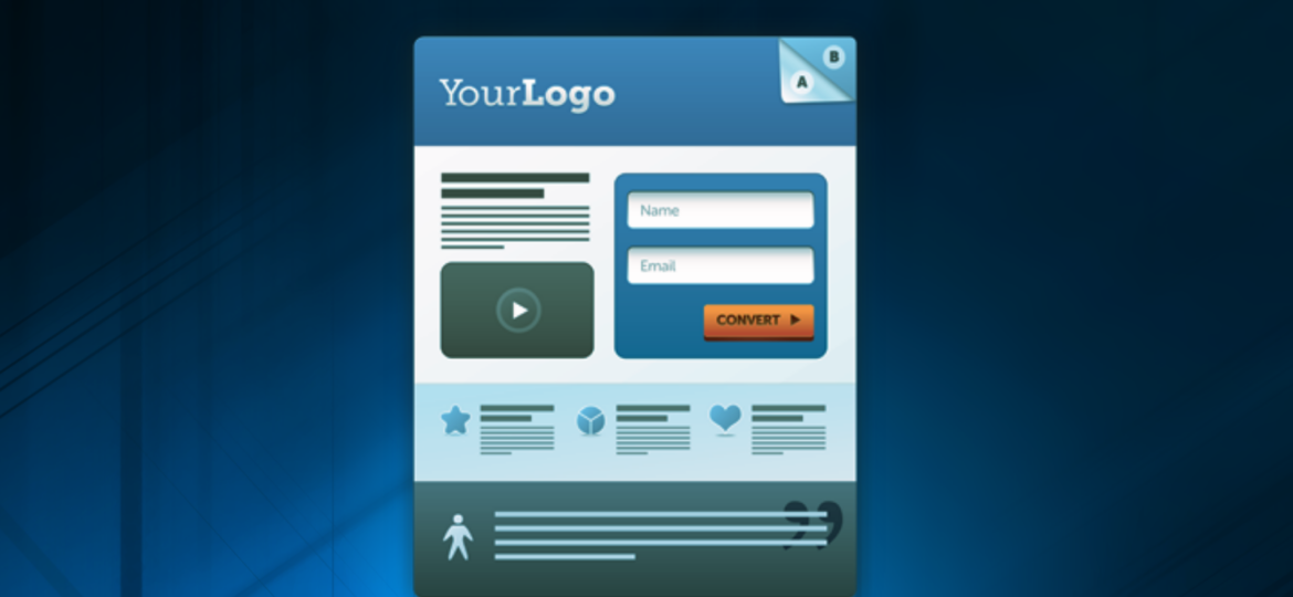
Landing pages are a key part of any digital marketing campaign. They are the first thing potential customers see when they click on an ad. Therefore, it is important to make a good first impression. A well-designed landing page can help you generate leads and sales for your business. In this blog post, we will discuss the components that every landing page must have.
The headline is one of the most important elements of a landing page. Therefore, it needs to be catchy and explain what the page is about. The headline should also match the ad that was clicked on to lead potential customers to the page. If you are running a Google Ads or PPC campaign, it’s important to make sure your ads and landing pages have the same messaging. As a result, this will help to build trust with your potential customers and increase conversions on your site.
You want your headline to grab attention while also explaining what the page is about in a clear, concise manner. The best way to do this is by using keywords that relate directly back to their search query so they know they are in the right place.
SUB-HEADLINE
The sub-headline is another important element of a landing page. It needs to expand on the headline and give more information about what this product or service will do for them in their lives. In addition, you want your sub-headline to be clear while also giving potential customers enough detail. Therefore, they know what they’re getting into before making any decisions about your product or service.
VISUALS
The visuals are another important part of a landing page. They help to break up the text and add interest. Therefore, you should use images or videos that relate directly back to your product or service. This will help potential customers understand what you’re offering them and increase conversions on your site.
It is important that your landing page has at least one image or video to break up the text and add interest. Images should relate directly back to your product or service. You can use visuals such as screenshots from the app itself, photos of people using the product, or videos explaining how the product works. In addition, make sure your visuals are high quality and accurately reflect what your product or service is offering. This will help build trust with potential customers and increase conversions on your site.
Landing pages should also be designed in a way that is easy to navigate. The buttons and links should be easy to find and use. Furthermore, if potential customers have to search for information, they are more likely to leave your page without converting.
CALL TO ACTION
The call to action is another important element on your landing page. It tells the reader what you want them to do next and should be placed at least twice throughout their content. In addition, it should be prominently displayed in bold letters near or above any form fields. This is so visitors know where they need to go to provide their information. And, it will help with increase conversions on your site.
“Call us today for a free consultation!”
SOCIAL PROOF
The social proof is another important element on your landing page. It shows how popular your page is by including testimonials or social media shares of people who have used your product or service in the past. As a result, this will help potential customers feel like they’re not alone and increase conversions on your site. Visitors will see that others trust you before they even begin filling out their information.
The social proof can be a testimonial from someone who has used your product or service in the past. Or, it could be an image of someone sharing their experience on social media like Facebook or Twitter. It’s also important that you include how many people have liked/shared this content. This is so potential customers know that others have had a good experience with your product or service.
This is an example of social proof on a landing page.
“Over 100,000 people have used our product and we’re proud to say that they love it!”
CONTACT INFORMATION
A contact form should be easy to find and use. In addition, It should include all of the necessary information so potential customers can reach out to you easily. This will help increase conversions on your site because visitors know how they can reach out if they have questions about their product or service before filling out their information. According to Databox, most landing pages included 5 or more lead capture fields in the form.
-
Name (optional)
-
Email address (required)
-
Phone number (optional)
-
Social media link to Facebook, Twitter or LinkedIn account that you want readers to use as your main point of contact.

